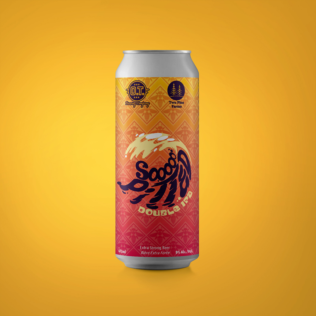
O.T. Brewing Company’s Sooooo Pitted Double IPA is a surf inspired summer seasonal brewed with honey from Two Pine Farms. For the label design I chose to follow the same structure as the “Starting Lineup” labels; sporting letter forms over a uniform background.
Oh, and there had to be bees.
I went through quite a few iterations of the central typographic logo for the beer. The type travels through the barrel of a gnarly wave occluded by ripples. The background was based on common patterns found on surf wear, with a swarm of bees replacing the floral motif. The whole can was finished in a gradient and colour pallette reminiscent of the rich pinks, oranges and purples of an ocean shore sunset for maximum chill, summer vibes.