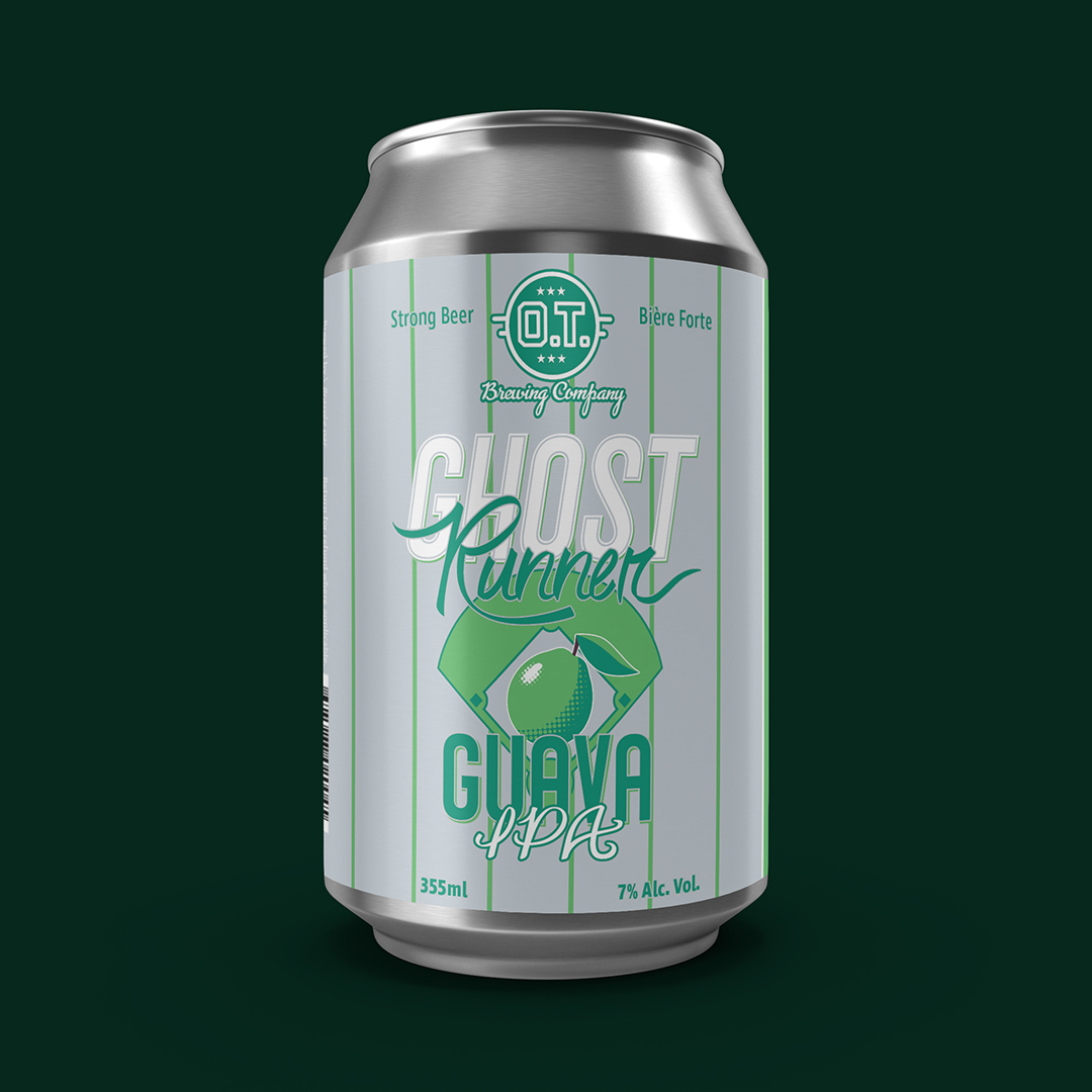
Pinstripes and bold, hand-drawn type bring together this baseball themed beer label for O.T. Brewing Company’s “Ghost Runner” guava infused IPA.
None of the existing hand drawn cursive fonts in my library were really working for this beer’s logo, so I chose to create my own from letters I sketched out on trusty 8.5″ x 11″ copy paper and then converted to vector bezier curves for further tweaking in Illustrator. The extra-condensed sans-serif letters used in the rest of the logo were whipped up on a square grid so that I could ensure a consistent x-height and line weight throughout and to make it easier for me to create additional letters as needed. The whole thing was touched off with a baseball diamond motif and a simple fruit illustration. O.T. originally wanted a label that could be adapted with different flavour infusions to create a series, so all the elements had to be developed with a fair bit of modularity in mind.